Games
Review: Shantae: Risky’s Revenge
How long do you need to play a game before you decide you don’t like it? How many minutes are required before you say to yourself “Well, that was ten bucks wasted, thanks for nothing Steam’s Refund Policy.”
For me and Shantae: Risky’s Revenge the answer is “about an hour.”
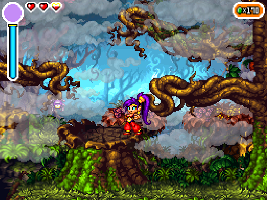
I’ve always wanted to play a Shantae game. The moment I saw the first one I thought it looked amazing. And it does, it totally does. I said to my friend “the art looks very Henk Nieborg” and he says “I thought it was?” Oh, it is. You can tell. The graphics are lush and gorgeous and detailed in ways that few other pixel artists can approach. It’s a very beautiful game.

But these graphics hide a horrible secret. The simple, tragic truth is that the guys responsible for creating the game itself had nothing to say. They had no interesting ideas, and based on the dumbass errors they made along the way, I don’t think they’ve been paying attention to games for at least a decade, possibly since 16 bits was a lot.
From the very start the game reminds me of early pre-Disney cartoons. You know the ones, black and white characters that seem to be made of wet spaghetti, always moving, for no reason except that the animators wanted to show off their skills. That’s what Shantae feels like. When standing still Shantae has this weird wobbly stance that should be charming but it comes across as trying too hard. I love the art, I love the graphic design, but it’s ultra-traditional, unambitious and takes no risks at all.

Settle down!
I don’t like the level design. Long horizontal strips with jump pads that must have been delightful on the 3DS as Shantae jumps into and out of the screen from one strip to the next, but serve to only confuse me. Fine, it’s a design choice I don’t like, and maybe I’d have gotten used to it soon enough, but there are too many other annoying issues for me to give it any more time.
Like the edges of these strips. Shantae approaches the edge of one horizontal segment, and passes through the edge of the screen into the next. Sometimes. Other times she just stops against the edge of the level, and there’s no way to tell before walking all the way up to the edge if there’s an exit there or not.
There are breakable tiles, they’re bright pink and easy to spot. They look just like the other easily spotted bright pink tiles that you can’t break. I’m not sure if there’s any way to actually tell which ones are breakable, except that the totally linear nature of most stages means that when something actually blocks you, it’s probably breakable. Unless it’s not. There are a lot of level elements that look like they should be platforms but they’re not, or they’re part of the level behind the one you’re on. It’s not at all obvious where you can and can’t go. A platform game that can’t make this clear has suffered a critical failure very early.
The game’s dialogue is just this side of annoyingly cheerful. I want to like it, and I sort of do. It plays a little bit with conventions, characters cheekily walking right up to the fourth wall and slapping it around a bit so that we all know they know it’s there. Good job… but please stop doing it so often, it might wear thin. I’ll never know if it does, I have given up.
The game just isn’t fun. Shantae’s attacks take just that split second too long, and there’s a separate button for clearing a dialogue box instead of just using one of the existing buttons like every other game ever and I just can’t get used to it.
It feels like the best artists in the world got together with talented designers and made amazing things but then, when it came to making a game that made sense, that was tight and fun and exciting and new, they just had nothing to say. They had run dry, they weren’t the guys who knew how to game, they were artists, the best of the best, and that’s just not enough.
Looks fucking great though.
--NFG
[ Jul 18 2014 ]
| Next Post | Navigation | Previous Post |
|---|


Name:
Email:
Website: