Games
Arcade Fonts: Only 64 Pixels
In just about every game ever made scores, instructions, alerts, and the gentle invitation to insert some currency and play need to be conveyed to the player.
Typically the quickest way is via the usual alphabet and symbols, and so game creators have always needed to create some fonts.

Generally speaking 2D games store their pixel resources in tiles, square chunks of imagery that are placed on the screen as required by the program. Fonts are not stored any differently. They’re usually 8 x 8 pixel tiles, easily found if you go digging through the ROMs of old arcade games.
Eight by eight isn’t a lot, really. Sixty four measly pixels within which to illustrate every letter, number and symbol that a game might require. And one of those columns is usually left empty to allow some space between each character.
(You can play with all the fonts on this page, and a bunch more too, on the NFGgames font engine!
Also, download a PDF version of this article!)
Fonts were important stuff. From the boot-up messages in Sinistar
to the gimme money message in Gyruss.

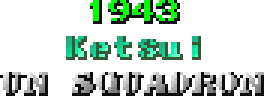
A good font required skill to create. It shouldn’t require time to decipher. There’s one arcade font which is perfectly legible, and can be found in games from nearly every manufacturer. First used in an Atari quiz game, it burst into existence and became the de-facto standard in the primordial ooze of the earliest arcade games, and was used until the last.

This ‘arcade font’ became the starting point for a lot of developers. Sometimes they tweaked a few pixels, sometimes they added colour, many of them added a shadow in the gap pixel. Irem’s Major Title did all three:

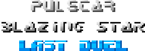
The majority of arcade fonts use a shadow, to ensure game text stands out and can be read against a myriad of backgrounds. The gradient helps too, giving text an extra dose of vibrancy and helping it maintain visibility. Ninja Gaiden didn’t stray far from the default, but uses every technique to really pop.

Most games used only upper case characters. When lower case letters were used, the results were not always good. The Roman alphabet uses descenders for many lower case letters like y, g, and q. As if it wasn’t a serious constraint before, eight vertical pixels can start to look very restrictive when a developer wanted lower case letters.
Capcom were big on lower case characters. Almost every game on their Power System 2 (CPS2) hardware used a similar font with both cases.
But notice how their rigid adherence to a consistent character height compromised some letters, like the lower case E.
They fixed this in later games on the same hardware, like Street Fighter Alpha 3 (shown below) but sometimes when they created new fonts, like the one used in Mars Matrix, the result was messy.
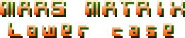
The word ‘case’ seems to indicate they were not being especially careful.
Many games managed the feat, however. Interestingly, and perhaps counter-intuitively, the thicker fonts seemed to do it well more often.


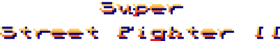
Solomon’s Key nailed it, but Image Fight failed pretty miserably. Super Mario Bros 3 and Panic Bomber reduced the height of the lower case letters by only one pixel, which made less visual difference but allowed for excellent clarity and consistency. Street Fighter Alpha 3 did exceptionally well, but the lower case p becomes crushed from below – an unavoidable consequence.
It is an amazing coincidence that all of the above examples are yellow/orange.
Like any alphabet there’s a generally accepted shape we can quickly parse, and designers had to stick to it.
Oblique and Italic fonts were uncommon. Where lower case was a matter of putting fewer elements in the 64-pixel box, italic characters required more space than normal ones. When done effectively italic text looked very, very good, but this was an elusive goal for most developers.
All of the features of normal fonts caused trouble in italics. Pixels were at a premium, and tough decisions had to be made.
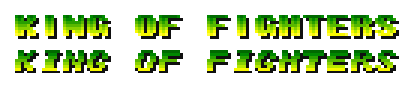
In The King of Fighters ’97 both normal and italicized fonts were used. The compromises are easy to spot: the brighter edges are gone, as the font is necessarily thinner. In this case the shadow was preserved, but the cost is uniformity. Some letters are thicker than others, like the F and I in Fighters. Others are awkward, like the T, and the letter E seems a little bit curved.

When it worked, it was totally worth it. Irem’s Ninja Spirit font was a workhorse for them, appearing in several games.


Speed Rumbler was one of Capcom’s better efforts, but Sega’s Dynamite Dux was perhaps an impressive but awkward attempt to do both italics and lower case.


Klax and Gondomania maximized the restrictive pixel count by anti-aliasing their characters, but still couldn’t quite make it work. Consider Gondomania’s M, and Klax’s K, which couldn’t maintain a consistent angle. (And why was the K in Klax not anti-aliased like the L? That’s just sloppy, Atari…)
Surprisingly a lot of developers made fonts smaller than they needed to, as if 64 pixels was a wasteful extravagance.
In 1982 Robotron used a very tiny font for the densely packed bookkeeping screen. Each letter was a miniscule 3 x 5 pixels. Some were necessarily wider, like M and W, but the majority were very tiny indeed. These are probably the smallest legible characters possible.
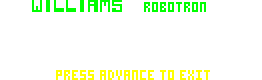
Williams was almost unique in their use of variable widths for each character, so that thinner letters took less space. This was incredibly uncommon, and almost every other game used a fixed width, no matter the character size. Variable width fonts increase legibility, but a rapidly rising score would leap around the screen as different numbers used varying amounts of screen space.
Though uncommon, smaller fonts can be found in many games, sometimes to allow the use of a surrounding outline.


Or in the case of Sky Soldiers, five pixels was enough for the alphabet, with one more used for a shadow effect.

SNK created a very successful slab-faced small font for The King of Fighters 2001, a mere five pixels high – seven with the outline – which still allowed a single pixel gap between lines of text.

Even at that reduced size, Taito managed some extra style and a pretty gradient in Ray Force. The same font was used in Hat Trick Hero.

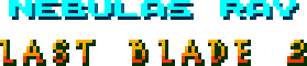
Some fonts were squashed on one axis but not the other, like Nebulas Ray’s squashed letters, or Last Blade – one of the only fonts with narrow, tall characters. While unusual, I’m not convinced the style was entirely justified. It’s not very attractive.
Colour gradients were a big part of arcade fonts. They made a font look more dynamic, and on a black screen filled with a colourful miasma they could still stand out.
A vertical gradient was the most common. Some games were so satisfied with this technique that they didn’t use any other, like Truxton’s startup text, above.
But there are many gradient styles. Aurail and Snow Bros. used a half-gradiated style a little suggestive of a horizon reflected on chrome.

A handful of games went for an echoing vertical gradient, like Taito’s Flying Shark and Capcom’s Willow.

Not all gradients were vertical. Horizontal ones were used, though rarely.

The second most common gradient is diagonal. A lot of games did this, with a surprising amount of variety.

Most went for a simple gradient while a few managed to pack an echoing diagonal effect into those few pixels.
Probably as a result of their Japanese origins, a lot of games went for a calligraphic brush script. This is particularly impressive considering the 64 pixel box they were forced to work with.
Some games attempted to capture a medieval feel, but these fonts almost always created some harsh results. Variable height lower-case letters were the worst offenses, but letters would often appear to lean at different angles.


One of my favourite styles is a thick, rounded-character font. It was a popular style, allowing the existing 64-pixel space to be almost fully utilized, and with careful use of lower case they rarely failed to look good.


Game developers loved their stencil fonts. They’re common, and relatively easy to draw: take an existing font and cut a vertical line out of the middle of it.
And of course, given the forward-looking nature of a lot of games, futuristic fonts are plentiful as well.
Other futuristic fonts were very common too. Or at least, they seemed futuristic in the 1950s when they were created to be machine readable, but are now sort of a retro-future generalized ‘computer’ font.
Thin fonts are particularly well suited to the 64-pixel grid. By not making all the character components thick there’s more room for shadows and other
embellishments.
The creativity of game designers did not seem to know any bounds. Much like the games themselves, the quality and effectiveness of their fonts was wildly
varied.
A lot of boundaries were pushed. At least one developer, the decidedly quirky UPL, created a font that had a real 3D effect in 64 pixels.
But not every font was created to be effective. Indeed some, like Bubble Memories from Taito, had fonts that were not designed to be read at all. This font was used when monsters spoke. If you squint, you can sort of see how each letter is based off the Roman alphabet.
Loosely.

There were a lot of non-Roman symbols found in arcade fonts, if you knew where to look. Japanese characters were very common, though usually required larger grids because of their complexity.

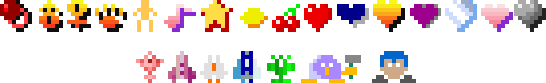
More often though the developers stuffed some fun things into the unused corners. Astrological gender symbols, critters, little icons of player ships, and especially hearts were common.
Sometimes the developers would try to cram unusually sized text into the fonts as well, like company logos, and in R-Type, the charge beam text which was 50% larger than the normal game font.

Then there’s this, from Namco’s tank blaster, Assault:

The most common not-quite-alphabet character was ED, for END, used when a player had finished entering his initials on the high score screen.

Ultimately, the best indicator of a font’s quality is its exclamation mark. In the best fonts it’ll be slighty tilted, a jaunty tip o’ the hat towards the player, a smile, a wink, and see you next time.
And some games decided that 64 pixels wasn’t enough, but that’s a story for another day.
--NFG
[ Oct 4 2016 ]
| Next Post | Navigation | Previous Post |
|---|
Comments
Qiqi Agatha
May 28 2022
Thanks for having this. I have been using your Arcade Font Engine for almost a year. It has been useful for both my blog & certain forum threads.
RYU-Senpai
Aug 4 2022
japanese text in hacha mecha fighter font has typo; it’s おはよー and not あはよー
NFG
Sep 30 2022
Oops! Well spotted. Thanks!
Name:
Email:
Website:


Taylor Love
Sep 3 2021